Company
Enterprise Pharma (confidential)
Role
UX Designer & Researcher
Timeline
2017–2019
Team
In-house UX center
Internal tools and processes at a global pharmaceutical company were slowing employees down, and leaders needed evidence to choose between options.
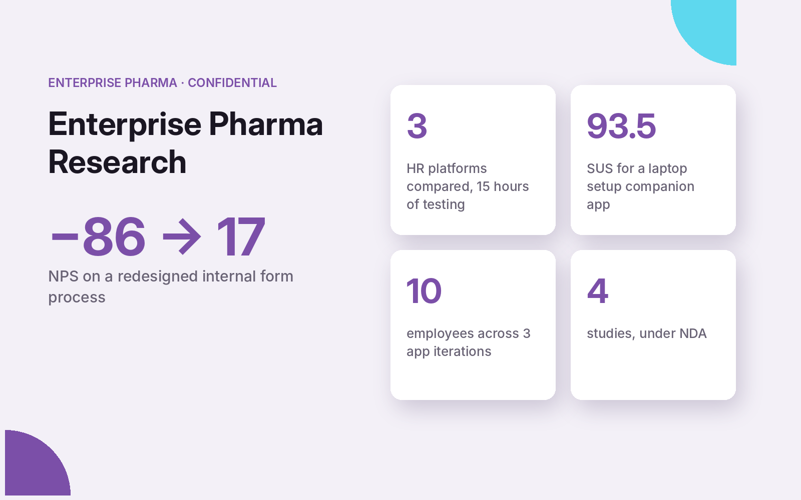
NPS −86 → 17
- HR platform recommendation across 3 vendors, backed by 15 hours of testing
- Laptop setup companion app: SUS 93.5
- Marketing request forms: NPS −86 → 17
This work is under NDA, so names, screens, and identifying details are left out. Full work available on request.
Choosing an enterprise HR platform
Leadership needed to pick one of three enterprise HR platforms. I combined light market research, heuristic evaluations by 3–5 experts across devices, and 15 hours of usability testing with employees and supervisors from several countries. Each platform was scored on task success, ease, lostness, and SUS, and every heuristic violation was rated by severity. The combined scores produced a clear, evidence-based recommendation.
Laptop setup companion app
The company wanted employees to set up new laptops on their own, at home or in the office. We tested a step-by-step companion app across three iterations with 10 employees, observing unguided setups. Each round fixed what tripped people up, like an unfamiliar voice assistant and a confusing 20-minute wait. The final iteration averaged a SUS score of 93.5, well above the industry average of 68.
Marketing request forms
Marketers had to complete several long request forms before work could start, and managers spent hours correcting incomplete submissions. I evaluated the current process against a redesigned prototype, alternating the order to reduce familiarity bias, and measured both with NPS and a modified desirability index. NPS moved from −86 for the current process to 17 for the redesign. Recommendations included step-by-step sections, content filtered by the user’s answers, auto-filled sign-on details, and the ability to save progress.
Icon and navigation testing
For an internal IT knowledge site, icon testing showed none of the participants associated a heart icon with saving, and every participant read the navigation arrows as dropdowns. I recommended a bookmark icon, a single share action, and clearer navigation behavior.
Work under NDA; additional details provided only upon request.
